
Ideas & Inspiration
We’re here to inspire and celebrate ways to stay connected to those who matter most. Share memories on your lifetime journey. Whether you’re looking to make the perfect photo book, greeting card, or decorative wall art, we’ve got you covered. Explore our innovative home decor tips, fun family activities, and creative ways to preserve your favorite photos.
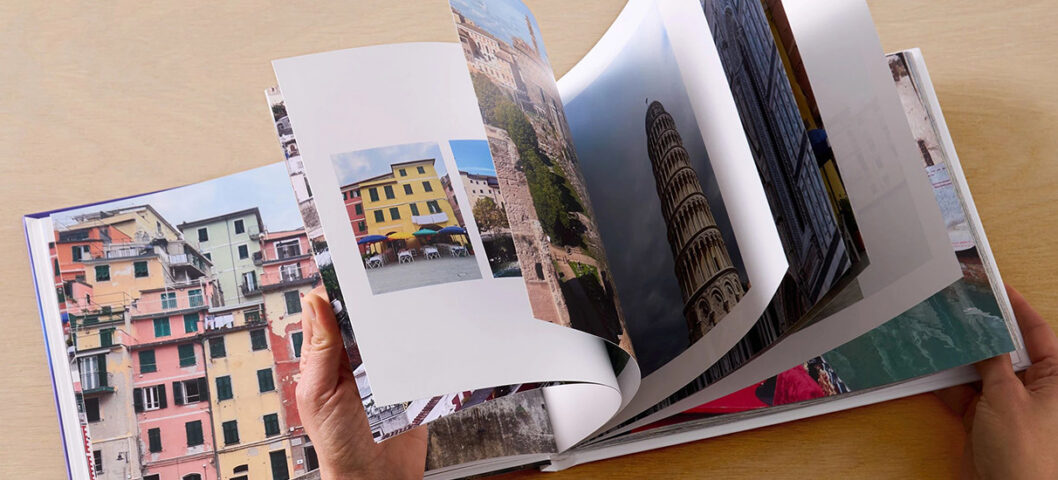
How to Make a Photo Book
Learn how to make a photo book with Shutterfly. Choose templates, customize pages, add text, and create a personalized photo book from start to finish. 4 min read
Christmas Card Paper Types: How to Choose the Right Cardstock
Compare Christmas card paper types, including matte, shimmer, recycled, and premium cardstock options, to find the best fit for your holiday cards. 3 min read

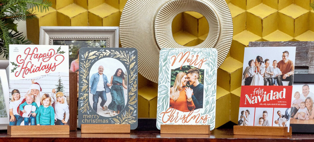
How Many Christmas Cards Should You Send?
Find out how many Christmas cards the average person sends and how many you should order, with simple tips for building your holiday card list. 5 min read
Are Photo Books Worth It? What Redditors Say
See what Redditors say about whether photo books are worth it. Explore the benefits, drawbacks, and tips for creating a photo book you'll revisit. 6 min read
What Makes a Christmas Card Memorable, According to Reddit
We explored Reddit conversations about Christmas cards to find out what people enjoy receiving, from photo cards and family updates to personal notes. 5 min read
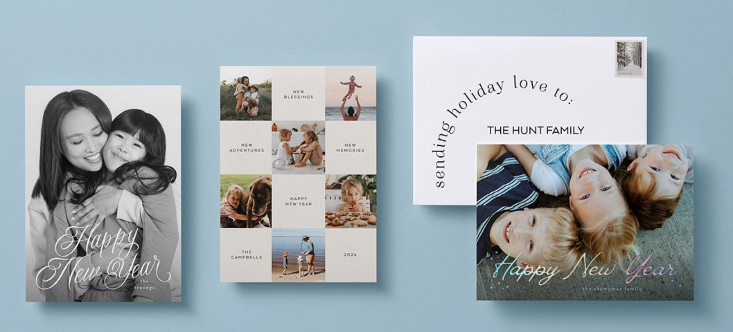
Everything You Need to Know About New Year’s Cards
Learn when to send New Year's cards, what to write, how to personalize them, and explore foil, envelope, and mailing options. 6 min read

101 Best New Year’s Resolutions for 2027
Discover 100+ New Year’s resolution ideas for 2026 to spark motivation, build lasting habits, and create a year full of growth and joy. 5 min read

The Best Personalized Gifts, According to Reddit
See which personalized gifts Redditors actually recommend, from photo books and jewelry to meaningful gifts made for the people you love. 7 min read
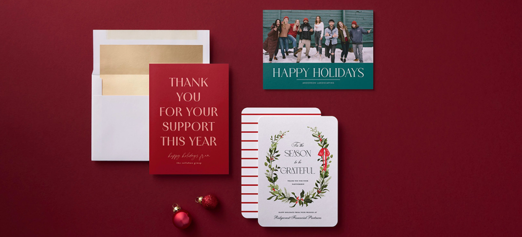
Business Holiday Card Messages for Clients, Employees & Partners
Find business holiday card messages for clients, employees, and partners, plus etiquette tips, signing ideas, and professional wording examples. 11 min read
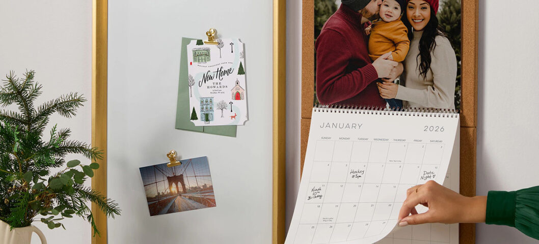
How to Make a Photo Wall Calendar in 6 Simple Steps
Learn how to make a custom wall calendar with photos, important dates, layouts, and personalized touches in six simple steps. 8 min read

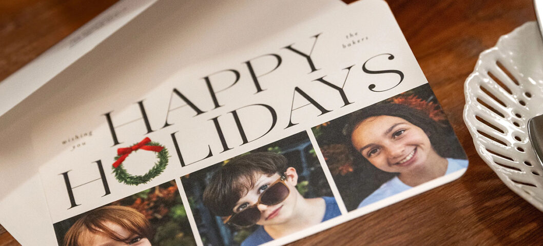
How to Address Christmas Cards Properly
Sending holiday and Christmas cards is one of the most important traditions for many households. Lean on our guide to addressing Christmas cards, including rules, tips, and etiquette to get your cards to everyone on your list. 3 min read